

(I did this case study a few years back - This is only to showcase my thought process)
Few years back in 2014, I purchased a smart TV by Samsung which had many apps including streaming apps like youtube and netflix on it
It came with a type-in search facility (input with remote or any other blue-tooth peripheral like keyboard or gamepad). I was very annoyed
with its interface and then I realized the need for better product. I knew I was not the only one to feel it with my television
(which was then the latest model out) therefore, instead of individual assumptions and experience I did research utilizing my
scientific knowledge and analyzed some results to come up with a better solution. Hence, this case study.
This is to provide a better UI for a TV interface app with an upgrade of Voice-UI than traditional
type-in-to-search-content facility. I thought at that time, a voice-UI would be powerful and better way of
communicating with your TV app, the only extra peripheral
needed would be if TV manufacturers could include a tiny mic.
All of us use multiple TV apps for watching our
favourite movies, dramas, serials and lots of other streaming content that we enjoy watching on our TV. Then,
why would people need this kind of app interface, especially when they have their own phones/tablets
and computers etc to watch, aren't those mediums better?
The answer is short but loud "No". Because the tablets/computers and phones (although provide privacy) are not at all
an alternative to the TV set. We all still enjoy watching TV and keep trying to purchase a bigger wider television set
to enjoy watching our favorite programs. If this was not the case then why people still purchase casting devices or
download apps that could bring this facility? Or even purchase convertible cables so watch what they want to on their
TV. Also the joy of being together and then watch brings more pleasure than on a personal device. This
also being the reason why TV sets are becoming more "smarter" day by day and provide in-built apps
to watch movies and series etc.
Let's look at what is the need for this app?
Research through questionnaire forms showed multiple problems with present TV apps
for watching movies/series/drama etc
among users from different background, analysed with SPSS (Statistical software). Qualitative results were
also analyzed with users' notes other than the questions included in forms
Research was conducted with a
Sample size n= 49
Gender 50% m/f (counter balanced)
Age: 18-75
Assuming that at 18yrs, one possesses a credit card(s) to be able to make online purchases, and that
are mature enough to keep my research closer to authentic and no "fun" lovers are dealing with my questionnaire
Following questionnaire (in a digital format via emails) was shared with the participants for data collection to be further analysed. Results of which have been taken under consideration before heading into conceptualization phase.

What one saw last time - based on previous search or viewed content the TV starts to show the similar content It brings no privacy if there are multiple viewers of the same TV
I observed that the interface of these TV apps is very overwhelming, specially as the app gets started. Although distributed under different genres and headings but it distracts and confuses a user
Navigating via remote control is a nightmare for searching or browsing, it discourages one to go through all navigational steps or type in longer titles of movies or series
For easier navigation or better usability, users keep switching between multiple apps available in-built in their TV set
Upon analysing the data from participants in the study I came up with a user persona that brings a closer look about our user attributes, habits, pain-points and goals.

All the attributes and other data from previous phases gave me an insight into user's journey over 07 days of experience with present TV streaming apps and what exactly our user thinks, does and feels during all of this

I sketched a flowchart to idealize user journey within app. The flowchart for "better TV" app looks like this

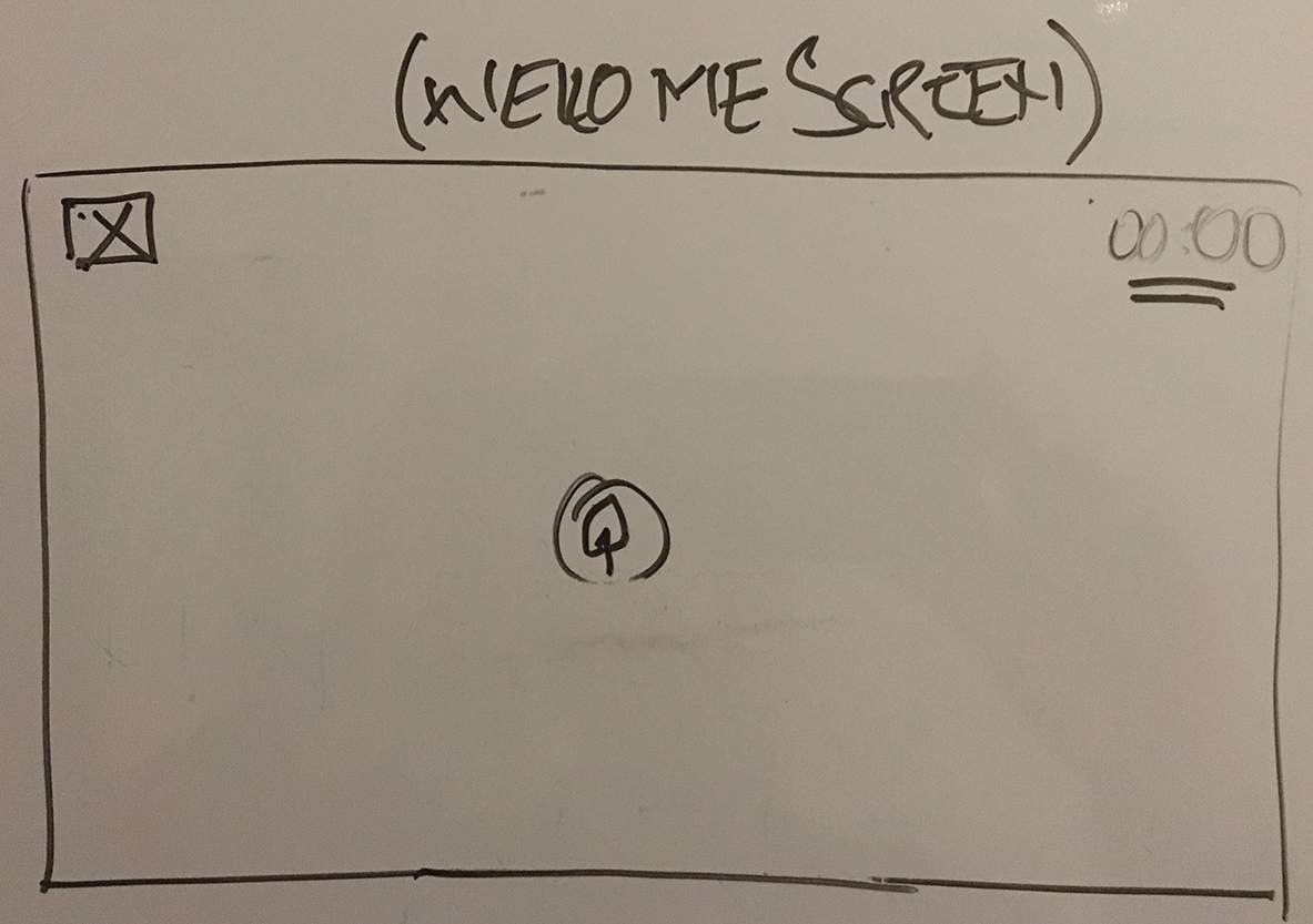
I came up with the following sketches to further conceptualize the app. I'm sharing a few for overall idea before getting into wireframing and prototyping


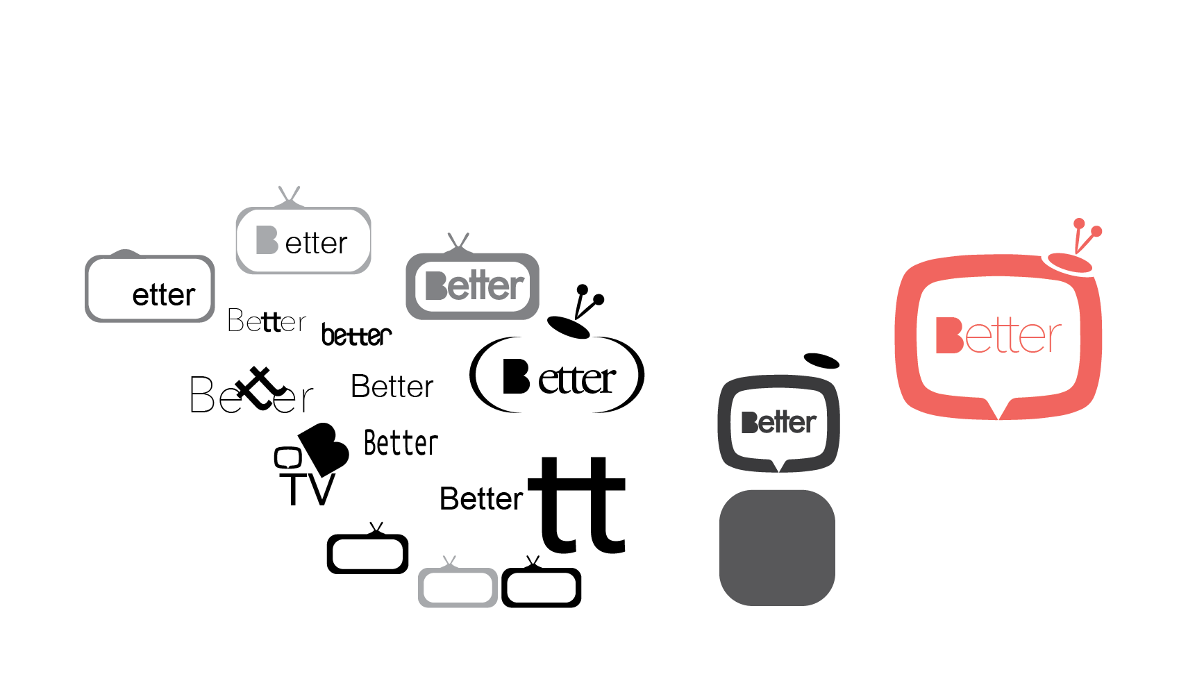
The complete visual language was devised using a design inception worksheet, which is as follows

For naming I was going for very trendy and cool kind of name for this app but then I realized it needs nothing fancy or glamorous title, I thought it is just another app but with a better version of others therefore I named it "better" tv app for "television" I created a TV icon and put "better" inside it, the filled letter "B" indicates the satisfaction and fulfillment it brings to the user. Pink is considered more finesse, therefore pastel pink in color.
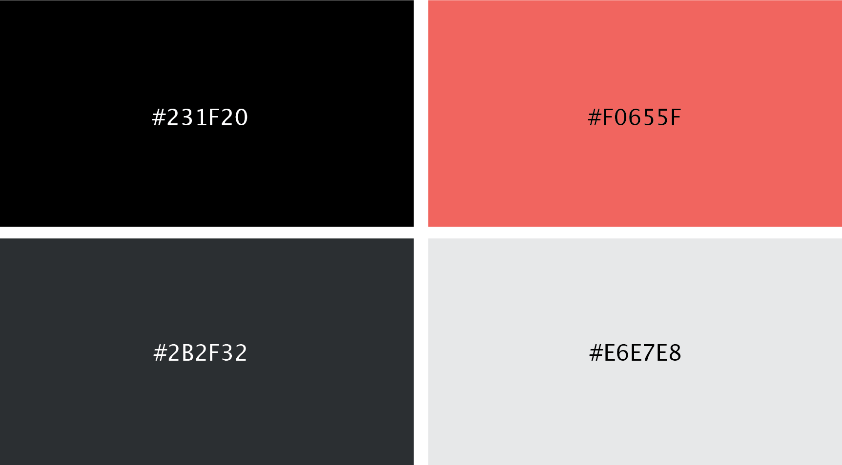
Following is the color palette I realized when creating this app. Very less colros but prominent enough for the viewer
specially at dim lights, will not hurt ones eyes. The content needed to be highlighted therefore a pastel pink is introduced as a highlighter
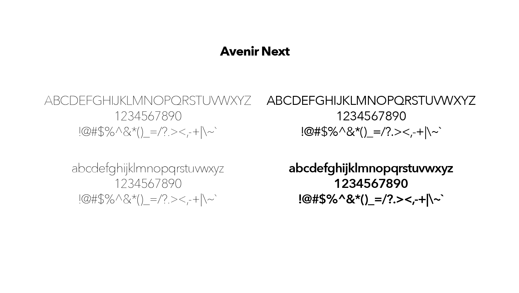
I was inclined towards more traditional fonts therefore I tool inspiration from the geometric style
of sans-serif typeface from early 20th century era and found Avenir (meaning "future" in french) and naturally
I was inspired with the sleakness of iOS font too, hence a later version of sans-serif fonts Avenir Next was chosen for this app.

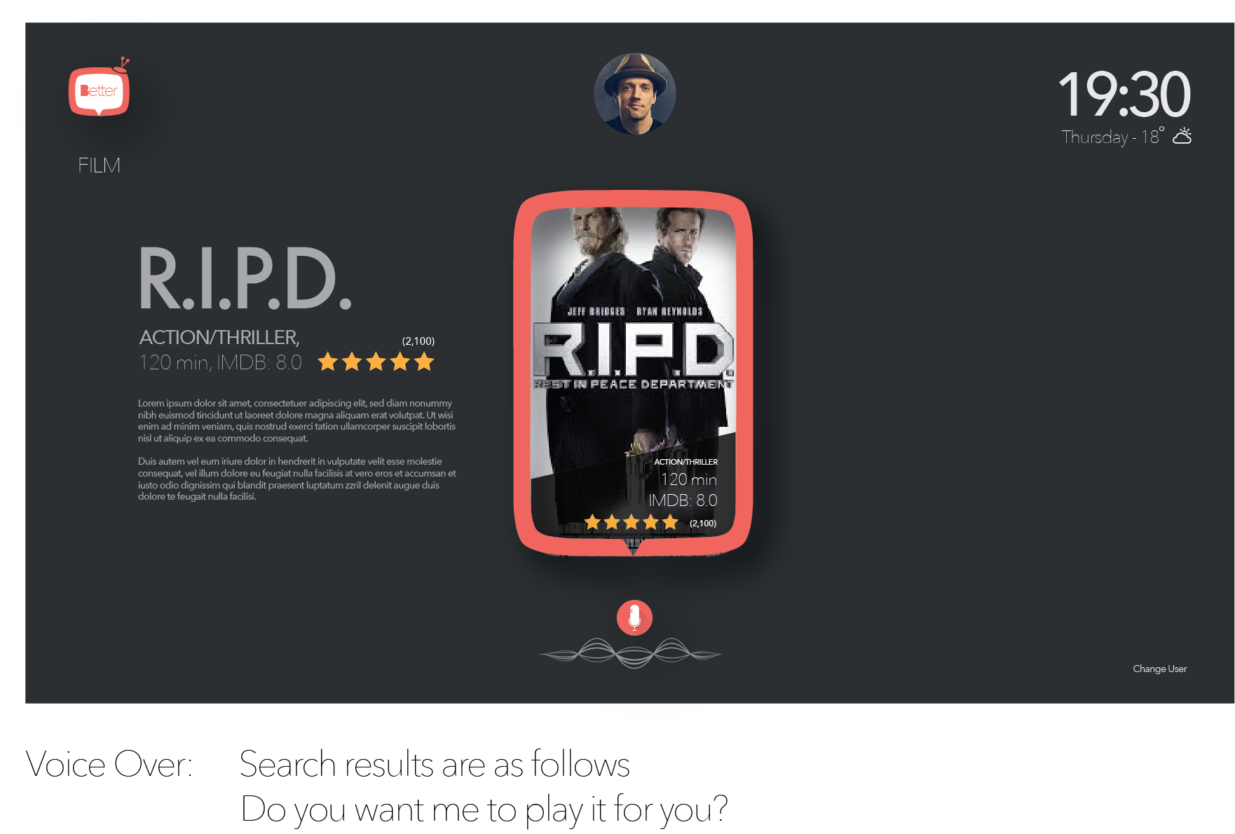
This is what I propose as a solution, a voice UI that leads a user through out the app journey
(messages can be seen below image) also provides
disability options or at any time switch to typing-in with keyboard. With Time, day and weather display
updates in real-time
To make it more private with customized language and other search criteria, for multiple users of the same TV, this brings an ideal personal viewing experience. The similar content as viewed previously will not be shared among other users, therefore account is mandatory for better user-experience or one can view content as a guest. the voice is first recognized via voice recognition and if successful, then further it for a specific user account.


Optimize interface with Voice UI to individually search a content or a complete genre of
contents, rather than numerous movies and series posters already present at the landing screen


With a choice of multiple languages at startup, Chinese/English/Arabic/Spanish, brings more ease and customization to search for the content. People with arabic-english accent probably wont get it right the first or second time. Also, it would be an interesting addition for voice-UI. To begin with only top four most used languages of the world cam be incorporated. Below is how apps provide interface to enter search item, the after (proposed) can also be seen below


Users like to search for their content in all available Apps like Netfilx, Youtube etc hoping to find it in at least one of them. Also, sometimes a preference for favorite interface (be it for colors/content/or navigation) push one to keep switching between apps. To ease this, a unified interface for all the apps would be a good idea so if users want they could either begin to search in individual app or multiple apps at the same time and don't have to keep switching between apps.

A lot has been changed since then, but when I came across this problem, naturally I was already stuck up with my investment in the TV set and no other TV was providing VoiceUI facility in streaming apps at that time. Purchasing products like Google Assistant or Amazon Alexa cost you further money, just like it cost me extra money to purchase Google chromecast to be able to watch my favorite content online on TV via computer. The hassle of searching and browsing was a complete disaster which led me think of a better product and produced a case study.
- It pushed me to think positively, how could I make it better.
- I was able to work out my research skills too and understand user more.
- I could utilize my UI/visual knowledge also and provided a better solution for a chaotic interface.
- What I produced, may definitely not be the best solution, but it taught me how to start thinking
about making products better.
