
Daily baking recipe and its ingredients be directly purchased from groceries. Tips on new recipes will help create more home bakers. Even amateur bakers would be able to bake anything they want.
Baking products at bakeries can be fresh or NOT. Home made baking products are always fresh and hygienic. But sometimes when you want to start baking all the necessary items are not available – this app will provide the facility to bake anytime of the day with daily new recipes and their missing ingredients could be easily purchased through groceries in collaboration with business and will be responsible to deliver the products where the request has been generated from. Thus the baker doesn’t have to step out again to purchase for baking as well as could be able to bake any time of the day.
I keep listening from my elders that no matter how much you love bakery food
and think its fresh, regardless of the size or repute of the bakery – if you once
witness yourself how they make bakery products in the back, would be your last day
to ever eat any bakery product.
It is actually true – every now and then we go to bakery to purchase something
without thinking if it is healthy enough to consume.
However, sometimes you have to go to a bakery as you cannot bake yourself but this
app will also help you become a baker for yourself and your family. You would be able to bake
anything you want at home thus fresh and hygienic baking. You would also be able to see daily
updates in baking recipes from contribution of app members.
Mostly people get discouraged by not having the same ingredients required to bake any specific product, that's why
they end up baking same products or else don't bake that day at all. People want to have liberty of not going out of home and
get ingredients be delivered same day so they could bake.
I did some survey with google forms and distributed it among multiple groups and individuals who bake on Facebook and around my peers. The purpose was to determine the problems they suffer when they want to start baking at home. Be it weekday or weekend or any special occasion etc. Learning about problems of potential users is a great way to be inspired and motivated. Working with real world data is good idea as I wouldn’t have to avoid guesswork and base everything on assumptions. This information would provide a better chance to discover the root of the problem and how to solve it.
- What motivated you to start baking at home?
- How do you prepare your baking?
- What is your biggest challenge when it comes to start baking at home?
- How much time do you invest in preparing the product (include time to purchase groceries)?
- I can not trust bakery products in regards with hygiene
- I am tired of baking same products again, looking up also does not help as it takes
lot of my time to search for something that has all the ingredients that i already have at home
- I don't want to get out of home and buy missing ingredients, I would rather skip it to bake next day when I have all
necessary ingredients
- I want to save money which is why I bake at home and they are clean too!
- Comparing prices to bake something takes way lot of time as I am price conscious
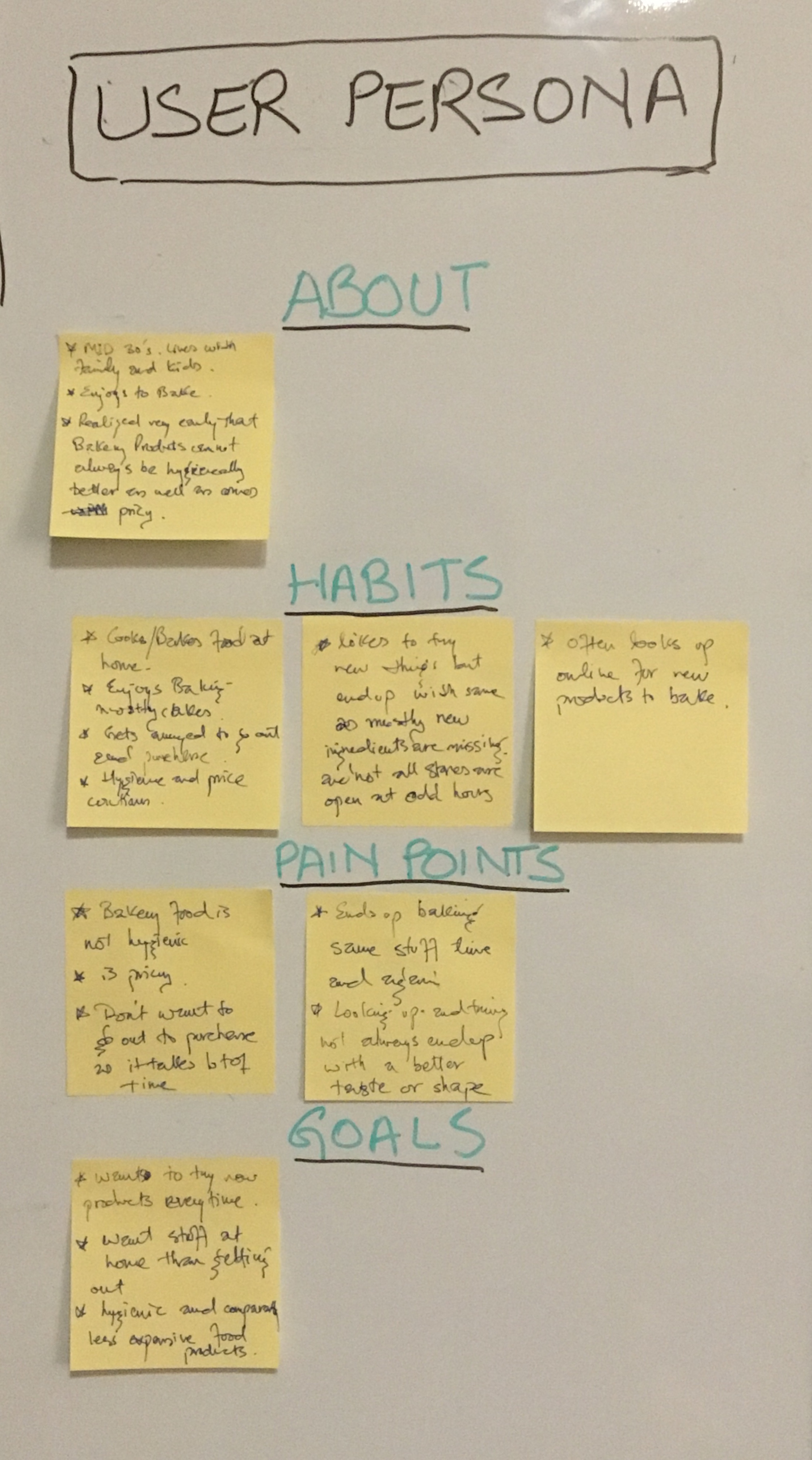
The results of my survey suggested that there were several types of users with diverse needs. The accumulation of the different insights and common patterns that came from the users’ answers helped me create a persona which is the manifestation of that data in a character. Focusing on a specific user helps to keep her needs in mind and not get distracted whenever an idea for a new feature or demand pops up
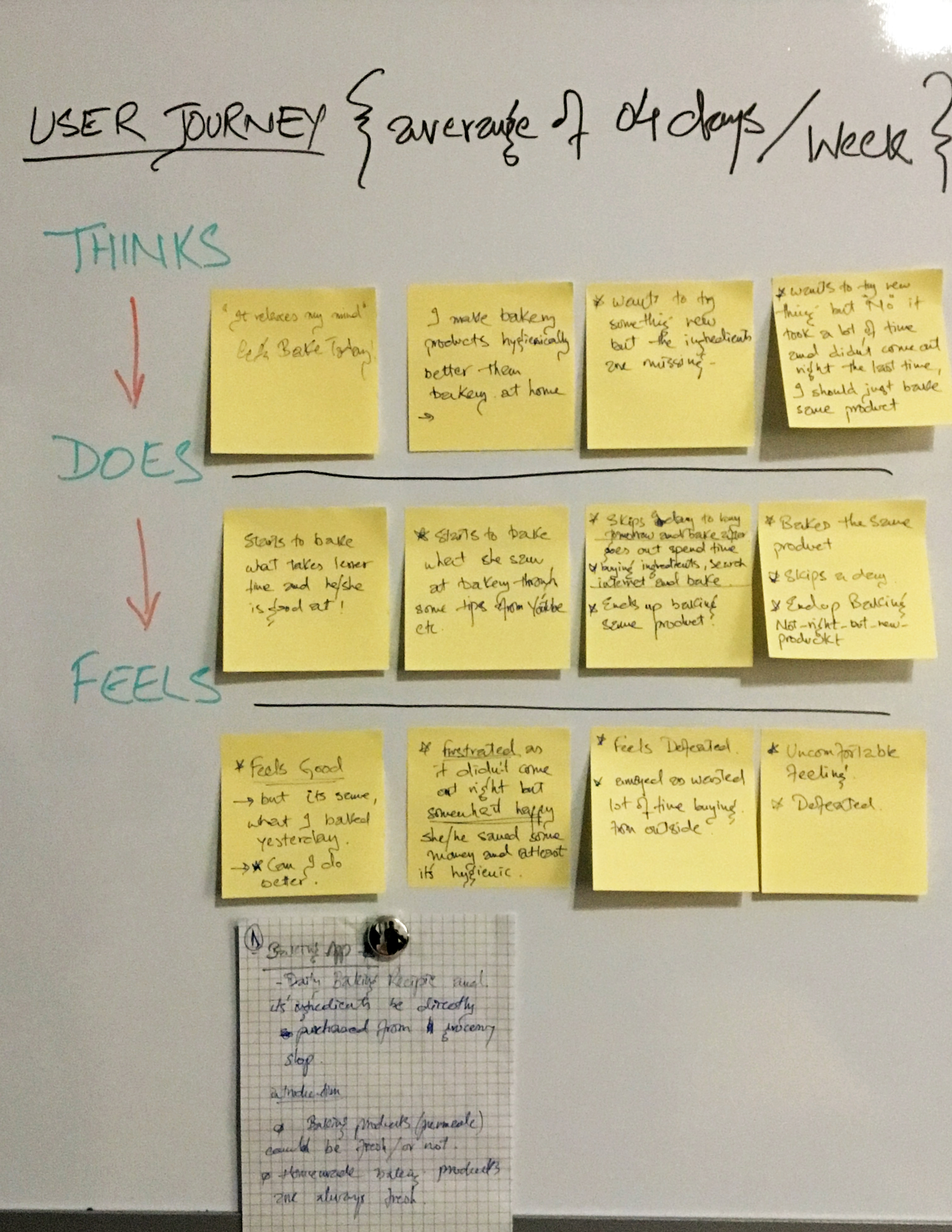
Next, I scripted a typical baking routine for my persona. This process helped me decide how the app’s
user experience might be designed to fit in with a baking routine
Instead of focusing on the problem – I asked myself why would people need a solution to this problem. By focusing on why I thought it would increase the chances of making a truly valuable product in the end.
Its always best to start with a flow of the app and from primary to secondary and then
tertiary roots towards solution of the problem. In the start it could be vague in mind,
so it was for me but later it became clearer as flowcharting takes place.
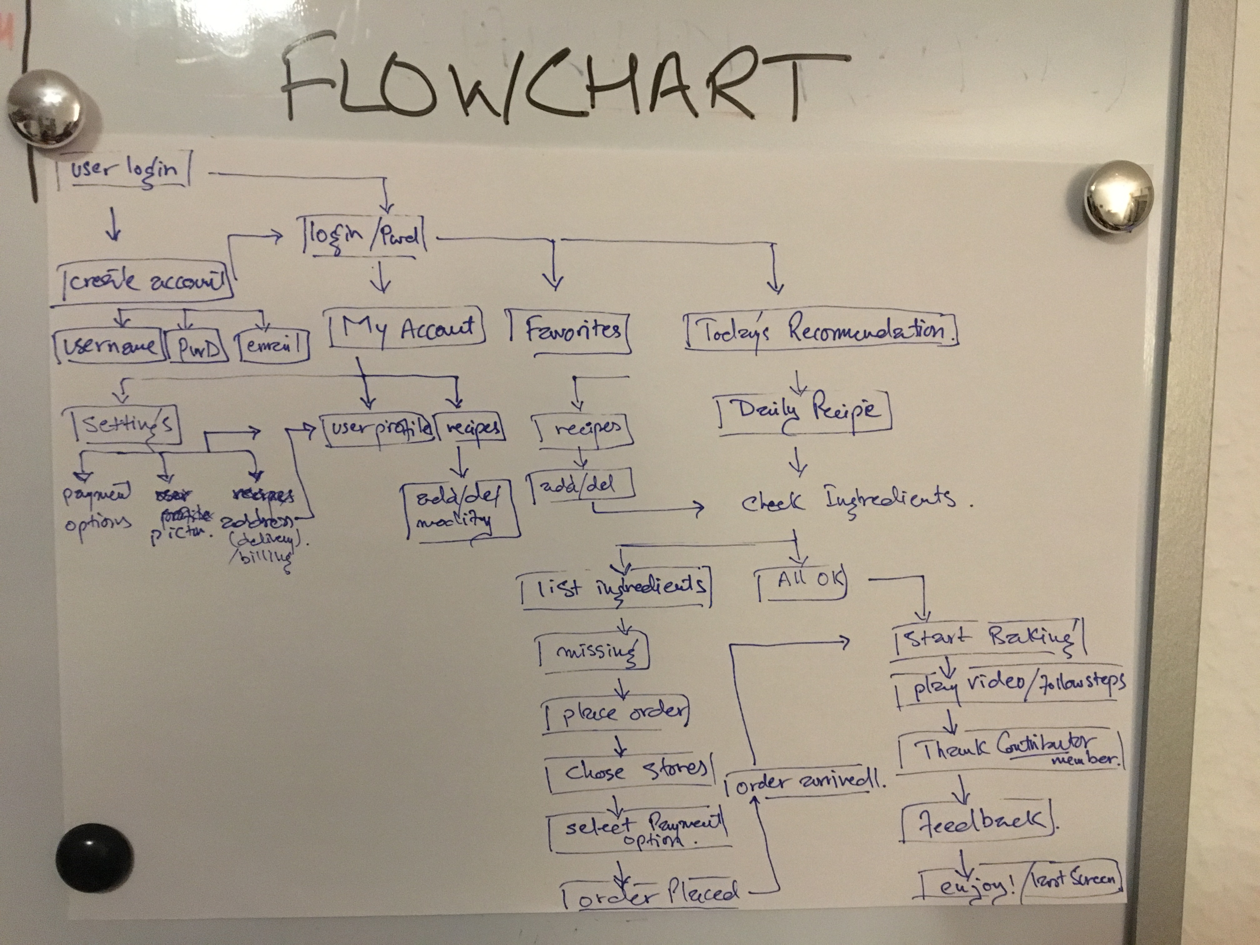
Flowcharting also helped me getting started to sketching up the app
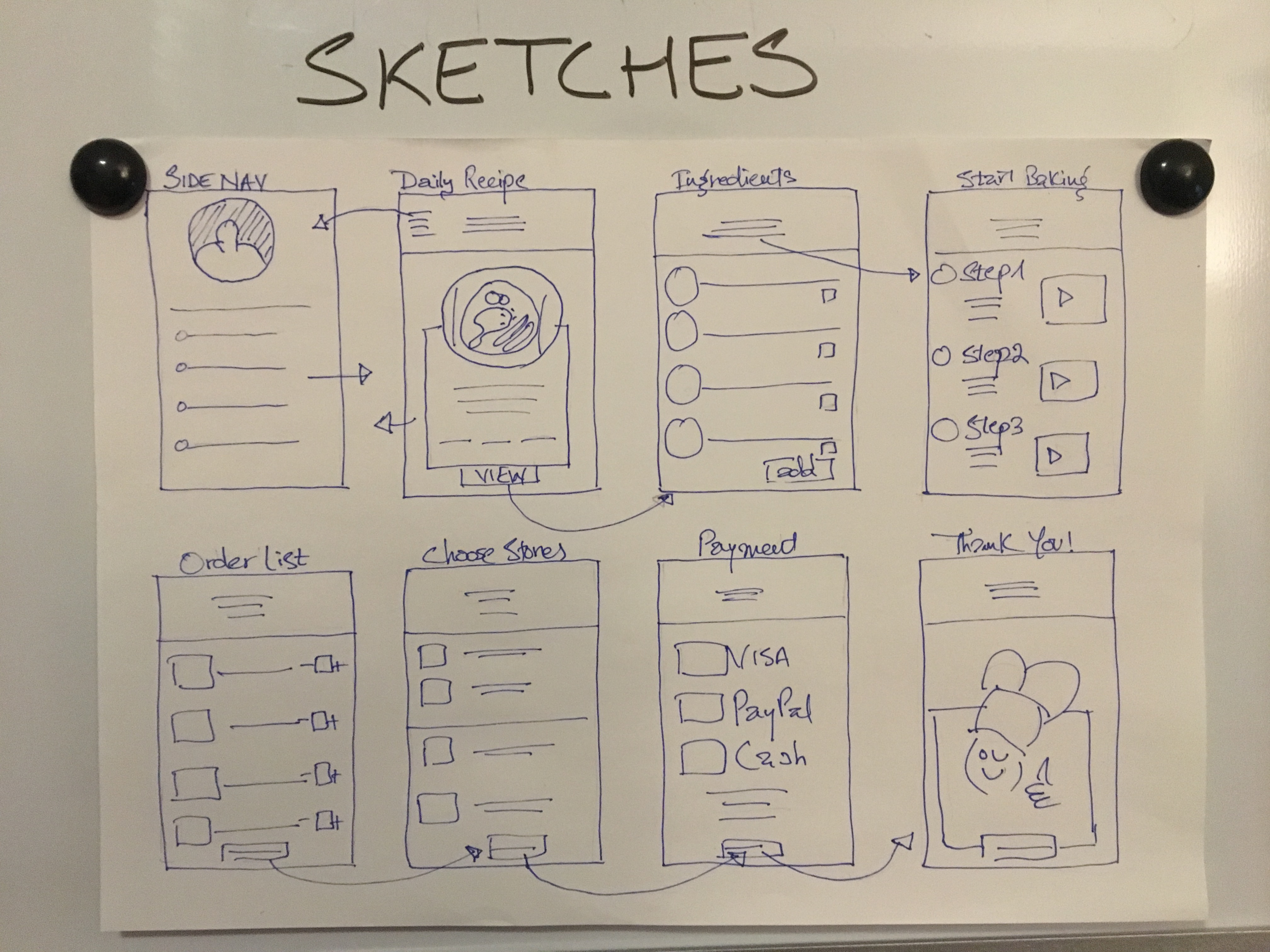
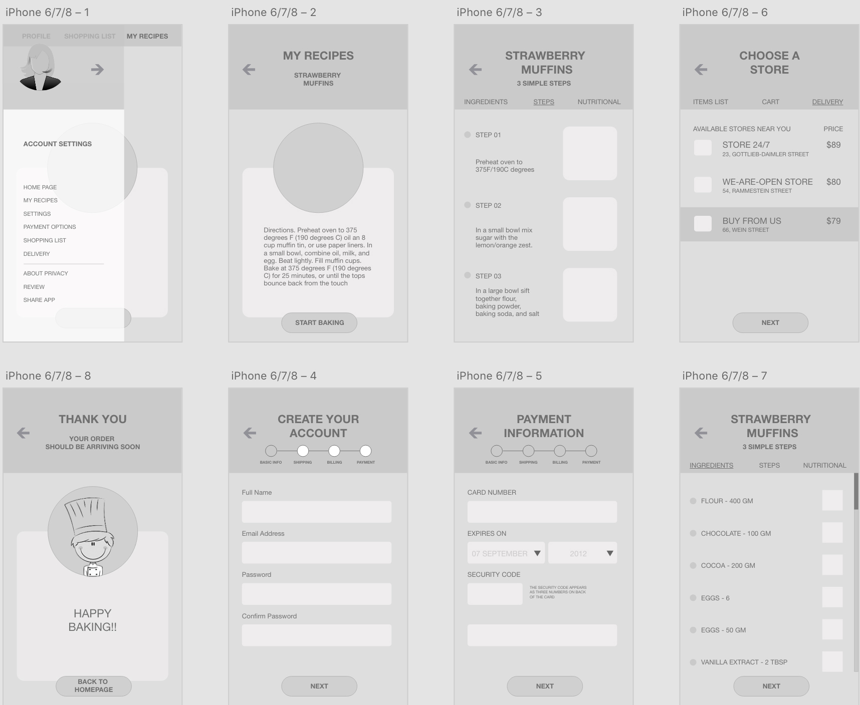
This visual guide represents the skeletal framework of the app. It helped me arrange the
interface elements while I focused on the functionality rather than what it looks like.
Moreover, the simplicity of wireframes allows me to quickly test ideas without diving into the details
I created a storyboard describing my user’s experience with the app. This is a great tool to explore how the product will be used in a larger context, as if it was a part of a bigger narrative. It’s an effective and inexpensive way to capture, relate, and explore the app in a real world setting. I created a storyboard describing my user’s experience with the app. This study helps understand the circumstances and the larger context in which the app will be used.
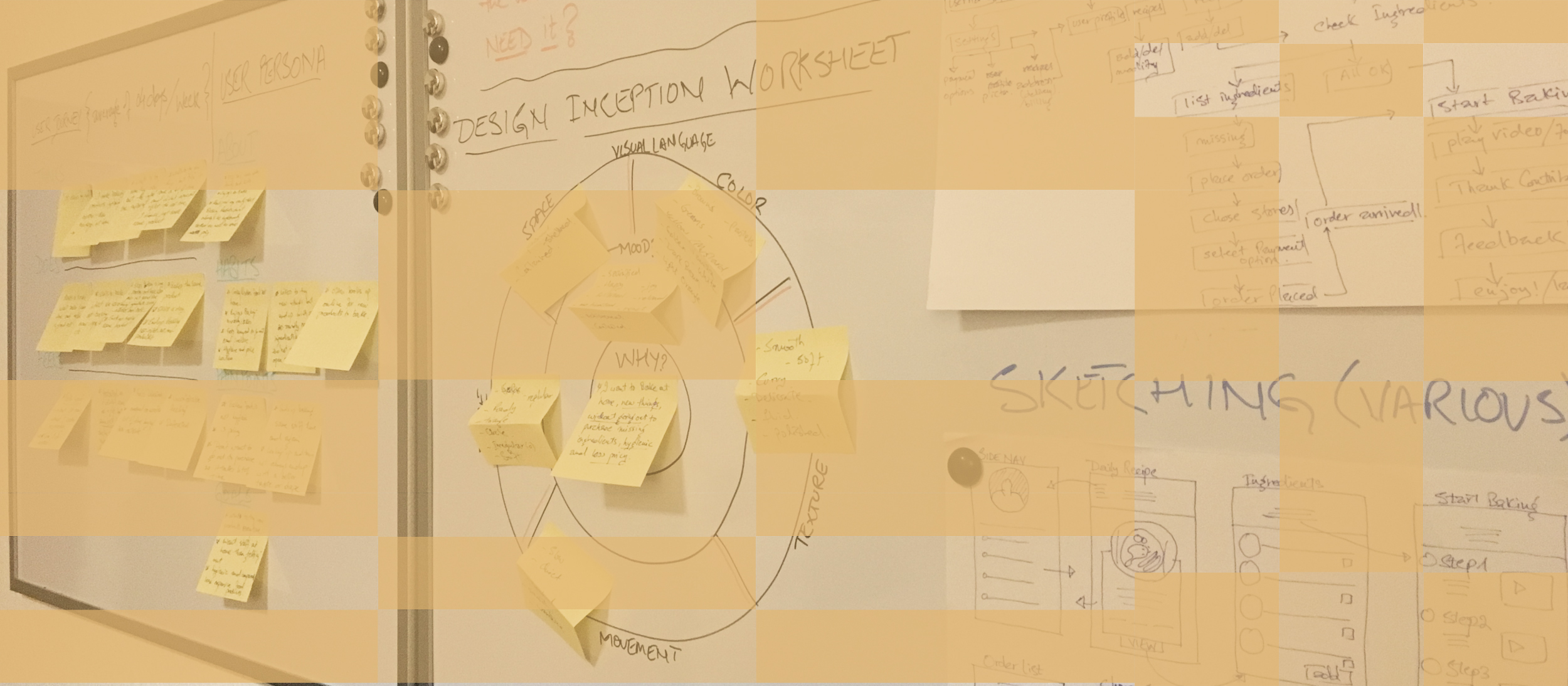
The Design Inception Worksheet brings thorough idea of the interfacing for the app with a central question of "why?"
then the "mood" of app was created followed by its five elements of visual language in the domains of Color, Shape,
texture, Movement and Space.
The organic brown symbolizes nature, life, health, hygiene, joy, renewal and revitalization.
Hence, a brown color palette is fitting for an app that promotes hygienic home made food. Additionally,
I used some shades of black for the text and included white to give some negative space as well as a
clean appearance.

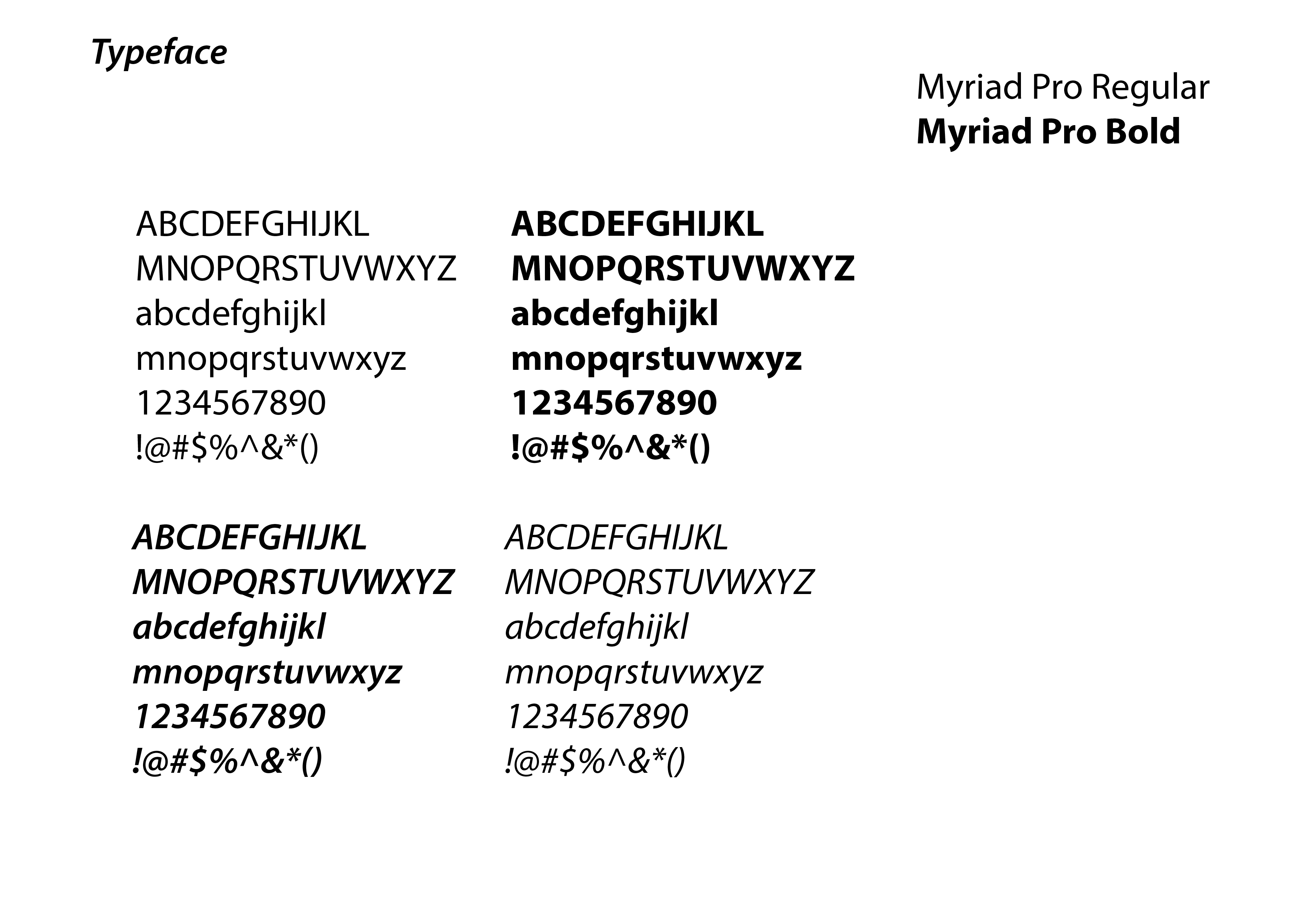
Myriad Pro is a well-balanced sans serif typeface superfamily that seems to complement
the interface. Simplicity and sofness were the leading factors; therefore, I decided to go with just one font family
The illustrations and icons are an important part of the design. They communicate ideas and concepts that
should not and sometimes cannot be communicated with words. Furthermore, they allow consistency of the
visual aesthetics that help build the users’ trust and produce moments of delight.
![]()
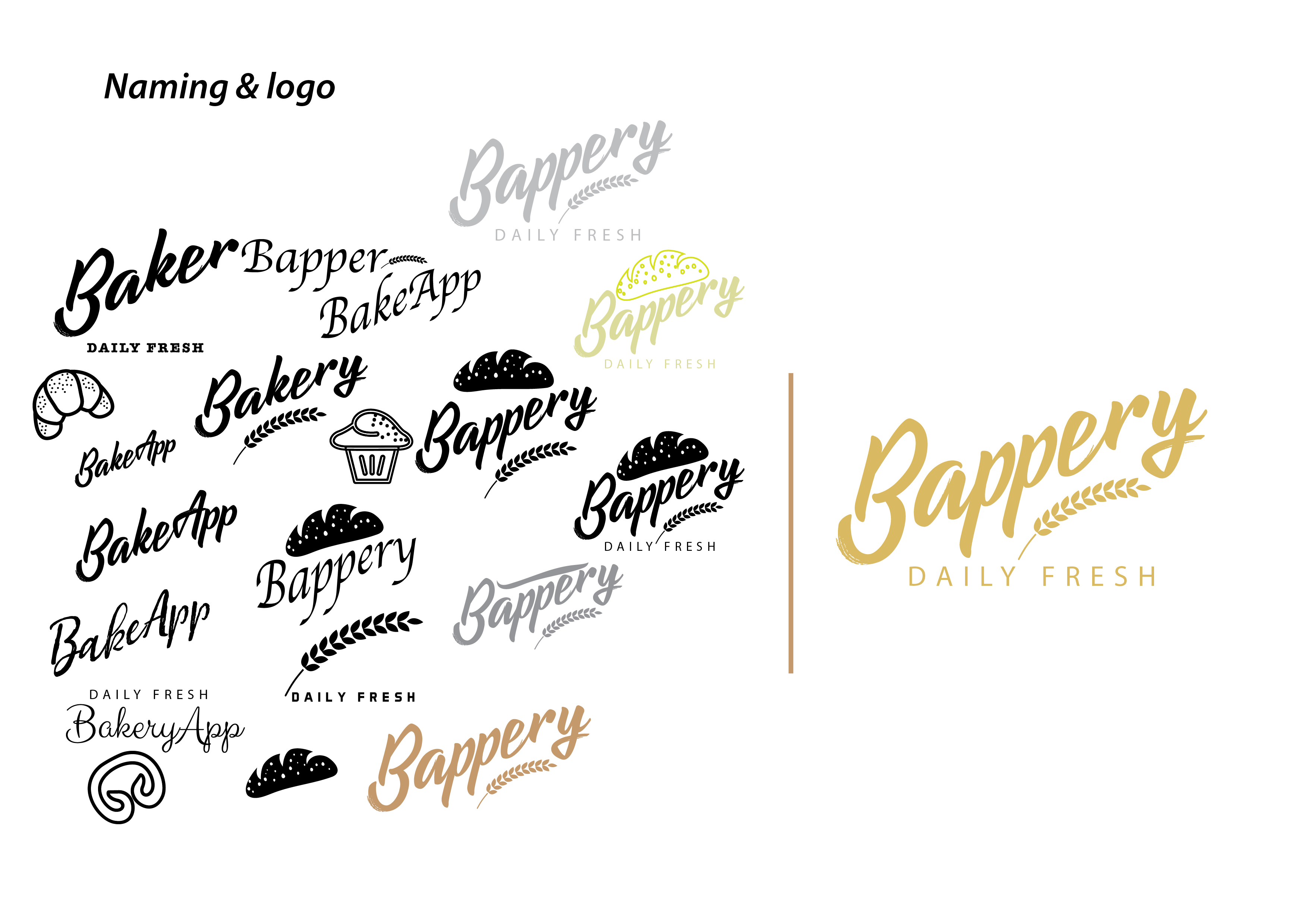
Bapper was old Scottish slang for a baker and it could also serve as a joint name for "bakery" and "app" together,
hence "bappery". It was coming out very practical and nothing fancy to have this name.
Also, the name was not taken so i thought would be interesting to take up. I also tried BakeApp with a punch line too
that could go along with it. "Daily Fresh" was simple concise and precise therefore I put it together with Bappery
as everyone enjoys fresh bakery products and one of the idea of the app was also to bake fresh at home. After mutiple iterations
I came up with this logo which is simple, has a baking element along with well balanced punch line underneath.
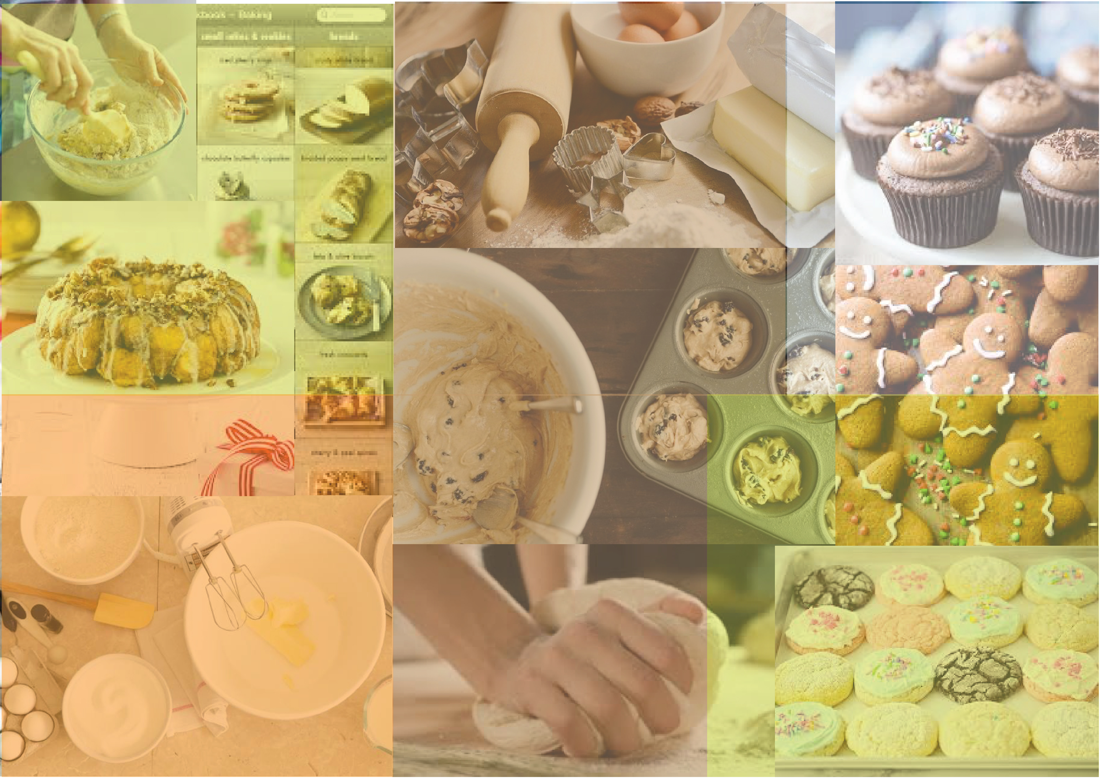
I looked up for inspiration and naturally relevant imagery that would be required for my app. The colors and complimentary
imagery gave me good idea of which type of imagery should be added.
The goal of the onboarding flow in Bappery is to collect information about the user to truly make it
tailored to their needs. The critical part was to have the user answer all questions without getting discouraged
and turn off the app. It required a simple and quick process. Therefore I thought to number the questions, big sliding cards
and included a progression bar to ease the process.

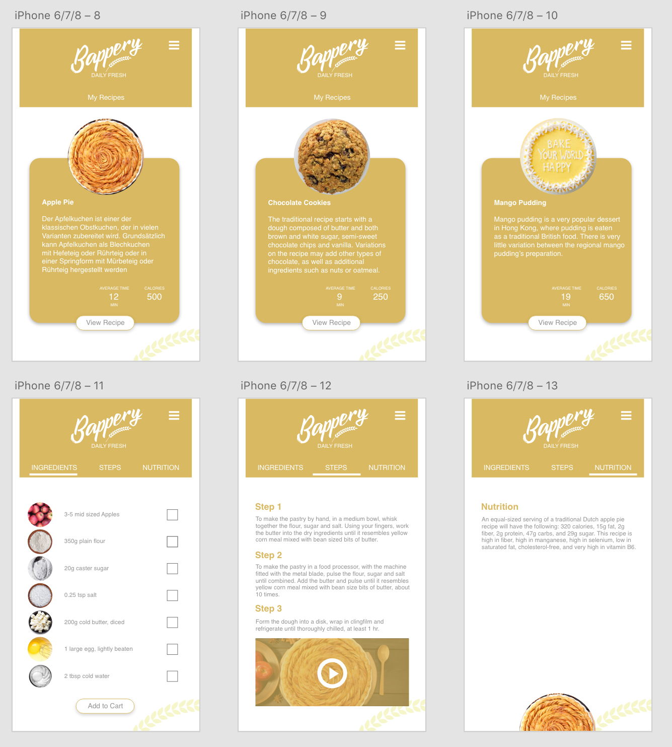
This element is the heart of the app. After signing in or creating account, users will have the ability
to add/delete their recipes and start to bake any dish they want to by viewing the week long plan for their baking automatically
added to their account. When viewing the recipe,
one can see a list of ingredients, three simple steps explaining how to prepare the meal, a how-to video and a breakdown
of the nutritional values of that meal
For extra convenience I decided to offer users an option to obtain all the necessary ingredients.
Therefore, the next challenge was to create a process that consisted of a shopping list,
picking a provider, comparing prices and having it delivered to their front door.
This procedure should be easy and quick to keep it in line with the app’s easy interface.

Designing the app has been a challenging and rewarding journey.
It was clear from the onset that the major challenge will be to make home bakers
interested in something that competes with the habit and ease of purchasing directly
from the bakery or go to the grocery shop, purchase necessary items to bake the same
evening or tomorrow specially when its Sunday and the stores will be closed. I researched
the habits, recipes and costs for homemade baking item. I understood the needs of the users
through the survey and conversations. Finally, I faced the challenge of creating an engaging
app both from the user experience perspective and the visual perspective.
• Deep research about specific features
• Usability test of the prototype with users
• Improve user flow
• A comprehensive business model
Pair up option: pairing up with friends and other users to buy ingredients in large quantities to save money and time.
The goal of this free mobile application is to allow users to quickly and easily make healthier food for their loved ones at comparable costs to premium items already present at bakery and at anytime they chose to bake. This app is designed to help part-time bakers prepare homemade baking products for their family or friends. The app provides a daily baking recipe ideas too for each individual member based on their choices of products they like to bake. The app also tailors the food quantity and can deliver the products from local stores. Daily contributions from other members for recipe ideas is an added feature. It is my hope that this app will be supported by a any baking producer or marketer, with the understanding that providing people with additional and healthier choices according to their needs and demands is socially a more responsible way to conduct business.
