"UI is focused on the product, a series of snapshots in time." - Scott Jenson – Product Strategist at Google
Online buyers desire to shop faster and seek precisely what they look for, as much as it is a UX challenge
it is also depending on the UI that leads to their destination. UI being more product focused provides the right
interface for that product or service a user is seeking for. UI seals the deal successfully
without distracting the focus of buyer
As a visual and UI designer I observed the lack of corporate style sheet specifically in graphical elements and pallette in atomic designing. Unfortunately, I couldn’t find monotony among different tabs on various pages and special offers banners but there is definitely a disconnect of color profiling and use age of graphical elements on different pages. Example: “ 10% discount code” under “exclusives” comes out of no where with its graphical elements and no grounds whatsoever with “zooplus” color profiling.
Even if the colors and other graphical elements do compliment the styling sheet (which I did not find in their website)– Yet there definitely is a big need for making them interesting enough to be clicked.
In an e-commerce business industry, it is mandatory and highly competitive to increase the
number of completed checkouts, the average order value (AOV), or increase holiday sales. Tiny details
matter a lot and that is why focus should not be deviated. Like any other business intelligence
department in different firms, Zooplus also brings out special offers to attract customers and increase
sales, from time to time.
It is highly important to work on “form” as well as the “function”. Price points play an important role, which is the functional part, at the same time it is necessary to glorify the offer, that is the form part. With effective and attractive layout for present offers, upcoming attractions and even “Selling-Hot Items” AOV can be elevated. Also, with increase in AOV would also impact impulse buying, that can be further exploited if the user-interface is attractive enough (offers on other related items, packaging confirmation messages with intriguing layouts and reassurance etc). I believe, there is a lot of room in terms of UI/graphics and visuals to be optimized. The results of which can be easily checked based on a simple research experiment using bucket testing/split testing and in the long run using growth driven design technique.
My proposed solution is concept based with a slight glimpse of interface further. First things first, I believe there is a huge room for further improvement in terms of visuals and graphics used to attract customers and visitors. To accomplish this task, I would go to my white board and start where it should start. I absolutely love the two eyes in zooplus logo and I think This itself can be played around as a mascot with varied color scheming representing different segments for zooplus with further varied graphical elements (yet belonging to the same family) . Or even serve the purpose by making it a “brand handle” for registered customers, buyers or simply visitors. It would keep hammering them “zooplus” in their minds as their first choice, every time they think of pets.
Breaking down of the whole website into basic components and then use them throughout in the form of
atomic designing. Adding corporate style sheets to define color pallette, typography sizing on
various media to enhance and achieve uniformity in overall look.
Other reasons why we should use atomic designing
• You can mix and match components
• Creating a style guide is simple
• Easy to understand layout
• Code is more consistent
• Quicker prototyping
• Easier to update and remove parts of the site
• More modular file structure
So the approach would look:
Atoms -> Molecules -> organisms -> templates -> pages
As it starts to flow right from the start in atomic design thus, I would define my graphical elements and
all color profiling with other essential components in the atoms - so it is adapted further in the future.
Here, I present you what I think would look better from a UI point of view and needs to be
adapted throughout after inclusion in the atomic design for zooplus website.
On the left is older design UI, (titled Before). On the right is modified UI (titled After). You can easily
perform Split/ bucket testing and get results. I already did bucket-testing and results are over 88% more
likely to chose design B.
Examples for the variables tested
- Subject titles and subtitles
- Product descriptions
- Text (length, style)
- Offers
- Price
- Images
- Call to action button (text, colour, position)
- Colour schemes
- Forms (length, question)
- Page layouts
The following images "before" and "after" treatment based on outcomes form design inception worksheet and
colors from Zooplus corporate stylesheet extract are projected as follows:
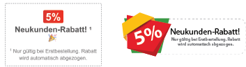
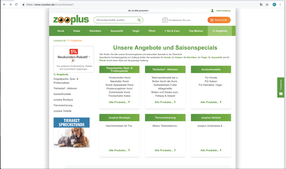
The "neukunden-Rabatt!" frame was not standing out (as being a special discount offer) and
needed to be more pronounced and attractive enough for any visitor to click it.
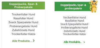
Sometimes only little things matter a lot - similarly, what I observed through bucket testing the results
were significantly different when a tiny relevant illustration of (pet) animals was added to the place holders

The complete cell looked like this with three in a row place holders along with different yet same family
of illustration icons for (pet) animals
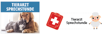
Naturally, when we talk about atomic designing and extracts from the color style guide, the adaptation was
observed in all the cells of interface. Notice here, the pictures were replaced with icons too, in order to
maintain the monotony of complete UI, also saves load time

All the cells including the side-navigation was also treated according to new atomic design palette in order
to maintain consistency

The UI for a single page can be seen, meeting the challenge of not changing the cells or rearranging the slicing of
website
If you notice I also added some flat graphics of random animals/pets to signify what we are centric about, our business i.e. pets/animals. Which again keep hammering at the back of the minds of visitors that zooplus = for myPet, every time I have to get something for my pet, zooplus comes to mind as the first option. It wouldnt harm to add these imagery to our atoms as they bring life to pages and a constant push to keep buying. Need not to worry about loading of the page becoming too heavy when we have base64 (fast loading images ) and SVG images (easily scalable without pixelation). Throughout the design B you will find a monotony among each and every element - be it over all sizing or color combination. No need for gradients in green when we have a beautiful color extracted from zooplus logo and other palette is simply driven out of the logo too. Overall I haven't changed the slicing or layout - but I simply optimized the UI as per visualization needs.
- Through out the website (desktop version) Solution: Extra white space on both sides, could be easily avoided with simple viewport use age. White spaces are good but sometimes makes subject boring. I added relevant pet accessories in the background made of line art and opacity set to 20% just so they shout aloud from back :) - I would also recommend a tagline for the business be prominent all along the web and other mediums wherever is presented (if there is any).
Learning never ends - Although I only worked on a part(page) of zooplus website, yet I learnt further - How to improve UI in terms of color profiling - Balancing imagery with relevant business without distracting the user making a purchase - How to keep up with growth driven design practices
