Scroll Down
Challenge
An Orascom-Vimplecom owned, Pakistan's largest telecom brand, Mobilink in 2012 needed to revamp its branding
due to global branding of Orascom telecom and its subsidiaries worldwide. it was not just an honor,
being a part of the significant
creative driving force, a team head and art director of Mobilink's creative advertising agency at Saatchi & Saatchi,
to team up with Wolf Ollins and bring a 360 degree brand revamp in 5-6 months time.
Taking up the challenge
Where Wolf Ollins contributed to the brand strategy for overall Online/digital media, Saatchi & Saatchi stayed as the
force behind creative execution on-Air, print, out-of-home, on-ground activities, expos & events and above all
the new face of Mobilink. A lot of responsibility with hundreds of hours of collective team effort, numerous brand-agency meetings and countless efforts
of creative minds and eventually a new face of Mobilink, was our task, and I being the head of the team (then) was ready to take up
the big challenge with focus and commitment. Since the brand team at Mobilink not only wanted to revamp its look but also
brought big changes and mergers of its baby brands into one single unit. Basically the brand also evolved
structurally to come out as one single unit, which is why a step-by-step yet comprehensive progression was required to complete the
revamping process successfully. A lot of market and user research was done before revamping,
keeping in mind the challenges (then) and to bring better solutions and perspectives for 3G and upcoming 4G network,
Mobile financial solutions, Pre-paid/post-paid, corporate social responsibility, and online services solutions.
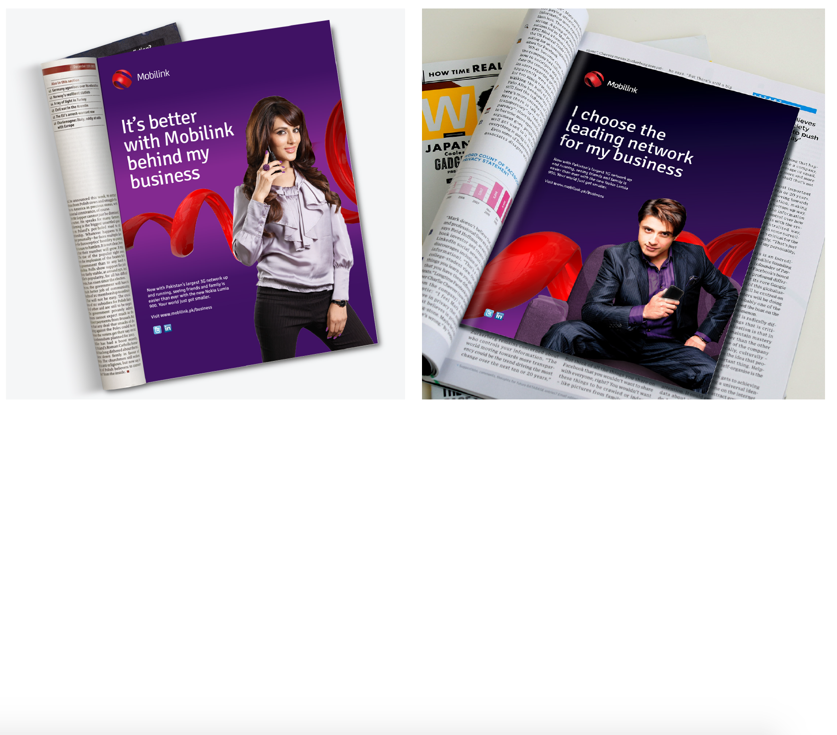
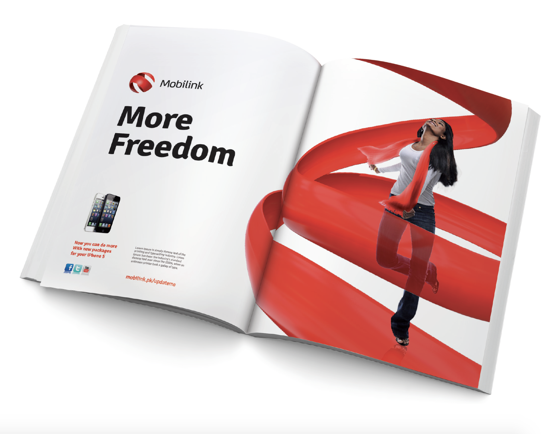
Our research suggested that the target audience wanted something vibrant, clutter breaking and unique at the same time
the brand team at Mobilink wanted the same yet keeping up with their corporate values - cut short here is what was then
revamped and is still going strong.
Art Director: Feroze T Malik
Creative Director: Scherry Ghyaz
Creative Managers: Imnov Salem, Sharjel Ahmed
Graphic Designers: Geebru Kahn, Inzi Haq, Imran Ichu, Kashi Rahm Chaudry, Saifudin Saifee, Tammy Ali Kahn, Hassan Julnoon,
Art Managers: Amjud sabir, Adnan Nazr, Nawaz Jadoon, Hira Ali, Asma Jehanghir
Junior Artists: Batool Fatmah, Nijja shah, David Hoole, Petrick Mc Caw
(please note only key-persons have been mentioned from arts department, else would be a very long list)
Client: Mobilink Telecom
Creative Agency: Saatchi & Saatchi
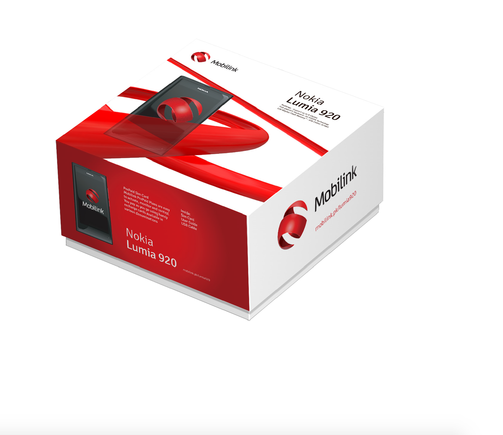
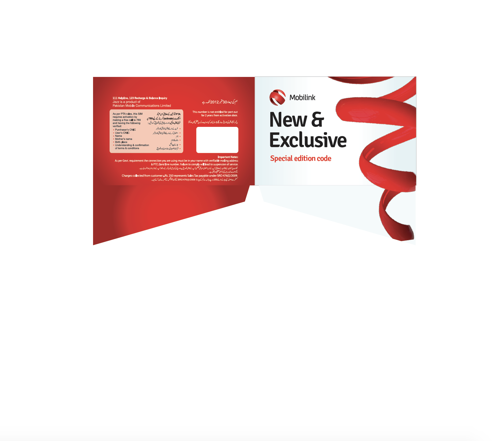
Mobilink Indigo (post paid) and Mobilink Jazba (Youth brand) together were merged into one
sub-brand, Mobilink Jazz, this time with
a new and modernized face uplift as you can see below


Rationale, the Orb:
Mobilink’s new identity reflects the brand’s core values.
The spherical shape communicates its leadership by representing it's global view.
Innovation is captured through the dynamic, continuous motion of the curves.
The collective spirit of its organisation is reflected through the openness of
the form which is inclusive to all.
Its heritage is never forgotten as the new form is inspired by it's original orb
and depicts the letter M in it’s static state.
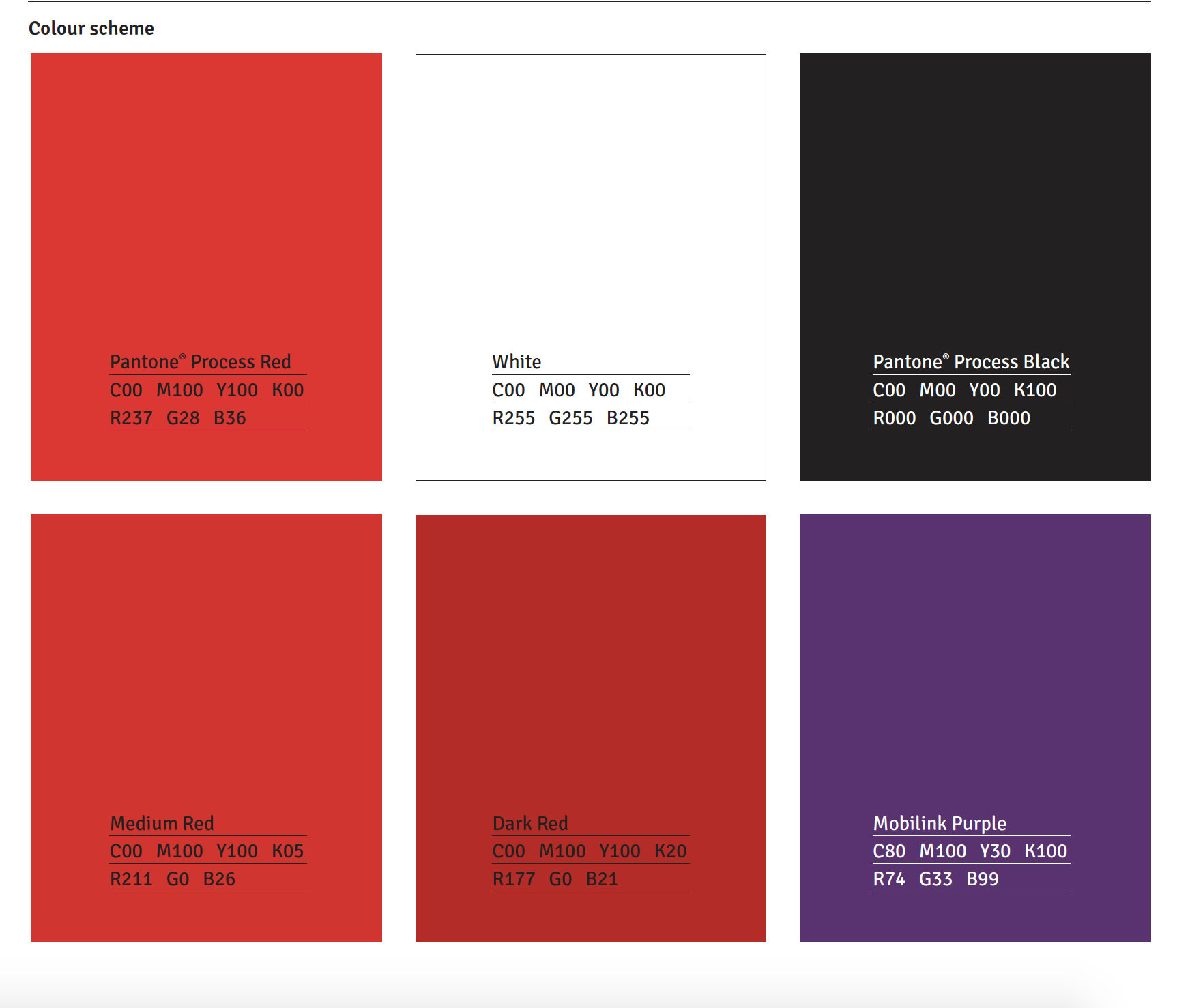
The colour red, so synonymous with the brand ‘Jazz’ has been carried forward to
add continuity to the transition.

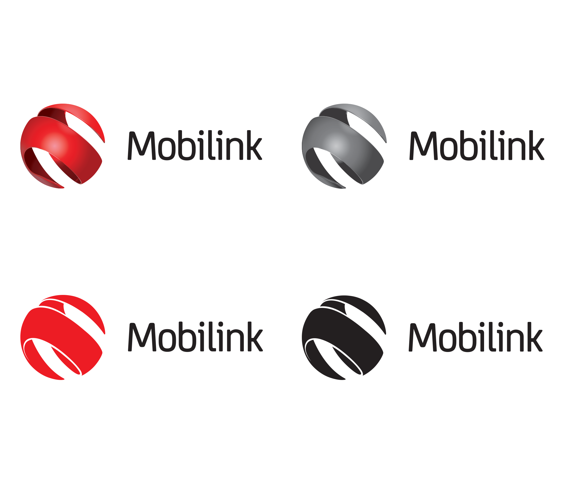
Logo variations:
It was necessary to devise logo variations to be used further
as various vendors have their own limitations as well as the brand has
to maintain certain restrictions too. The Mobilink Brand Identity could be
reproduced in the following colour variations for print applications.
It was made where possible to utilise the full colour version of the Brand Identity
to build equity in the primary colours of the brand. Single colour versions should only be
utilised when the production process dictates that the full colour version cannot be utilised.
The following were
the executions in various color scheming,
- Full colour version
- Flat colour version
- Grayscale version
- Flat grayscale version
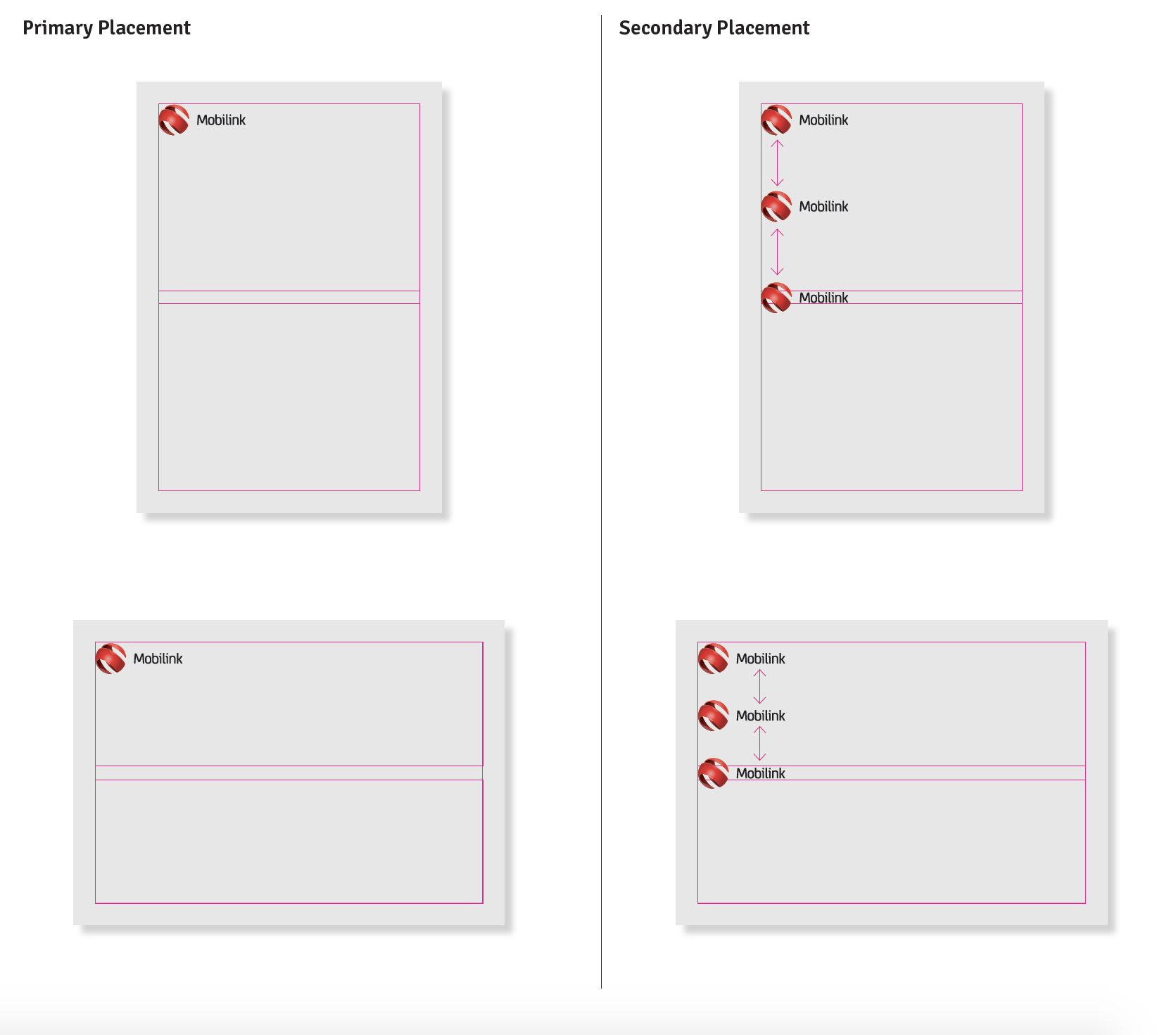
Primary & Secondary Lockup:
The Brandmark consists of two main elements as displayed here. The Mobilink Icon
and the Mobilink Wordmark. Both of these elements are grouped to form the Mobilink brandmark.
The Brand Identity has been created with great care and attention with specified exact markings as visible and can be
locked-up in only two possible ways, as below.


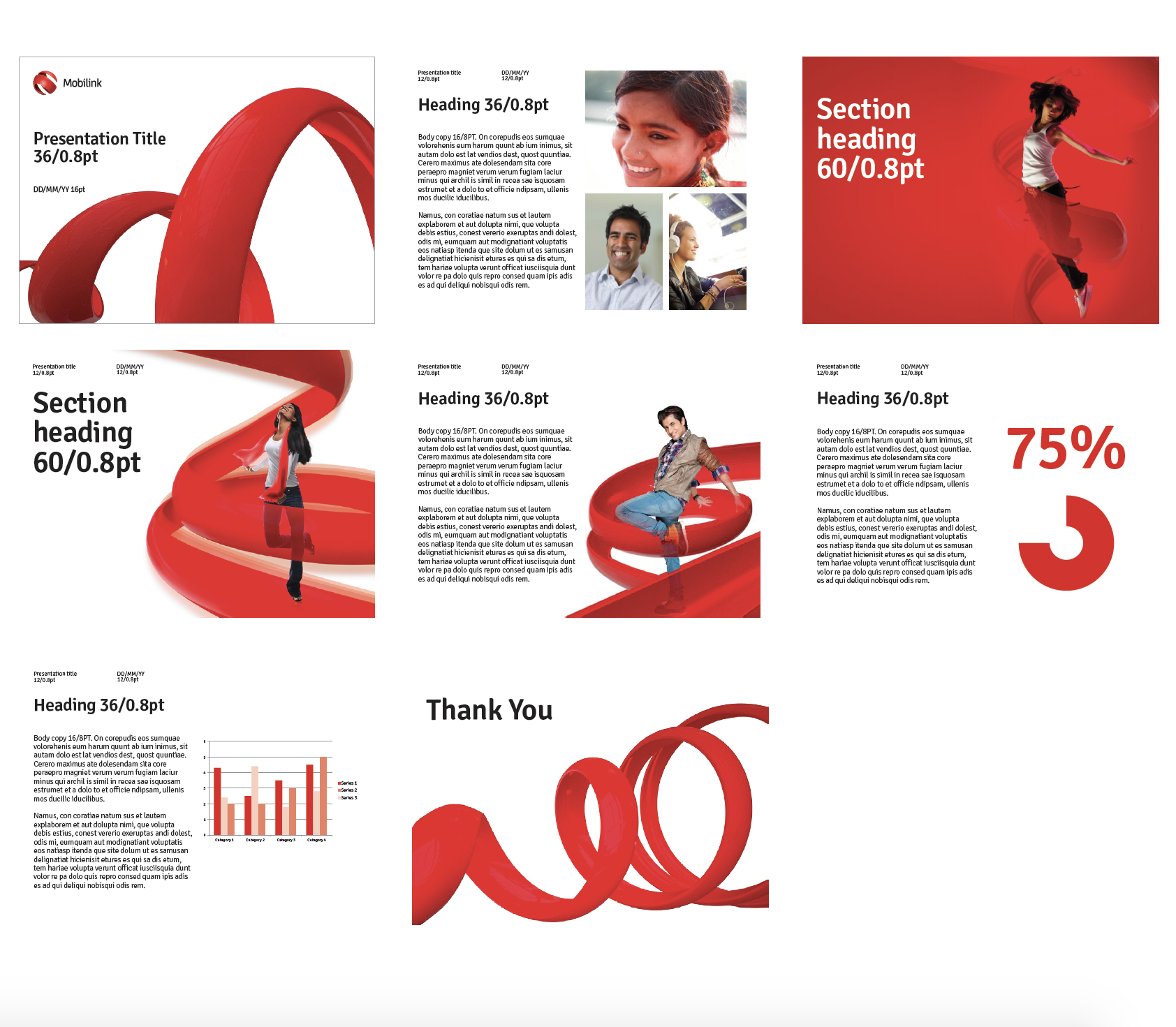
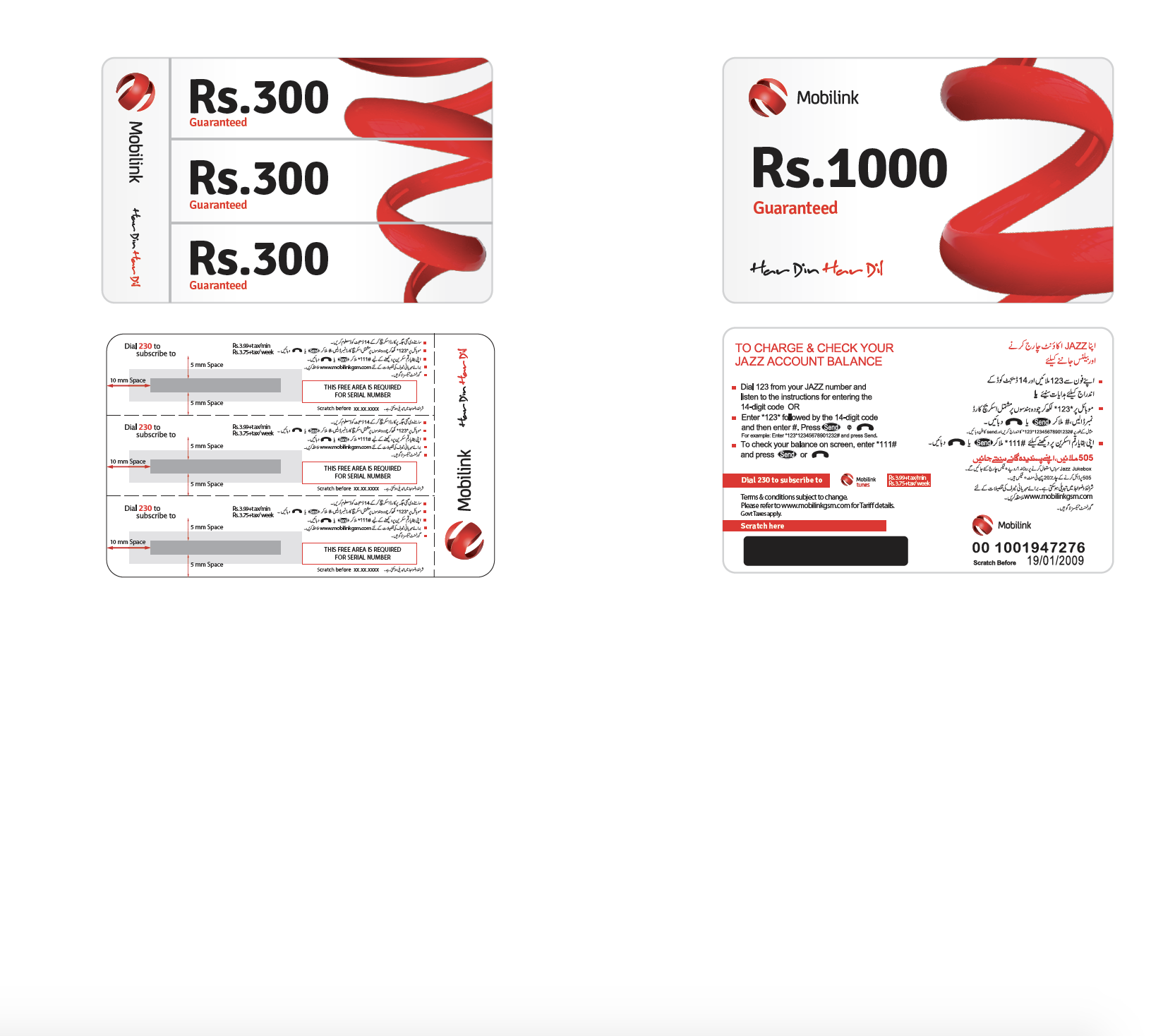
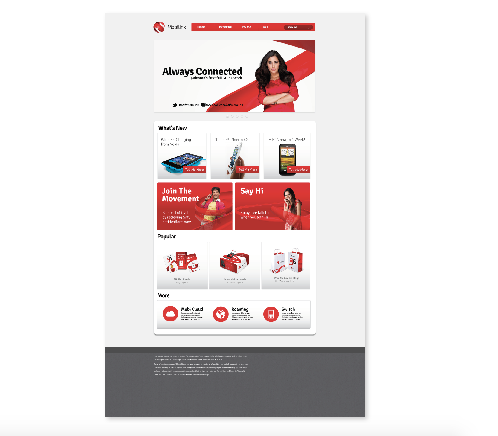
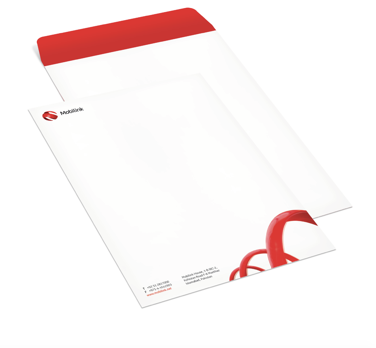
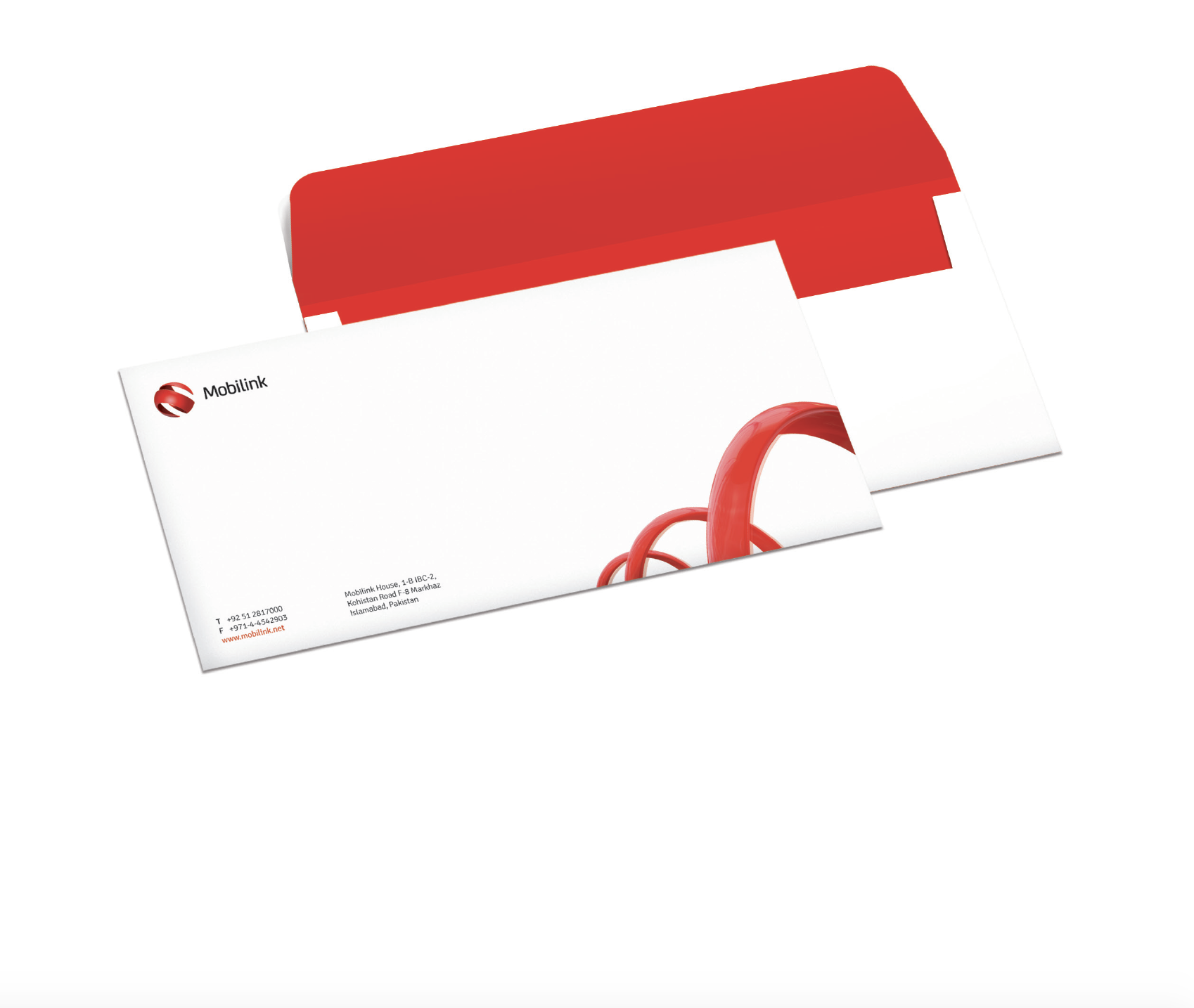
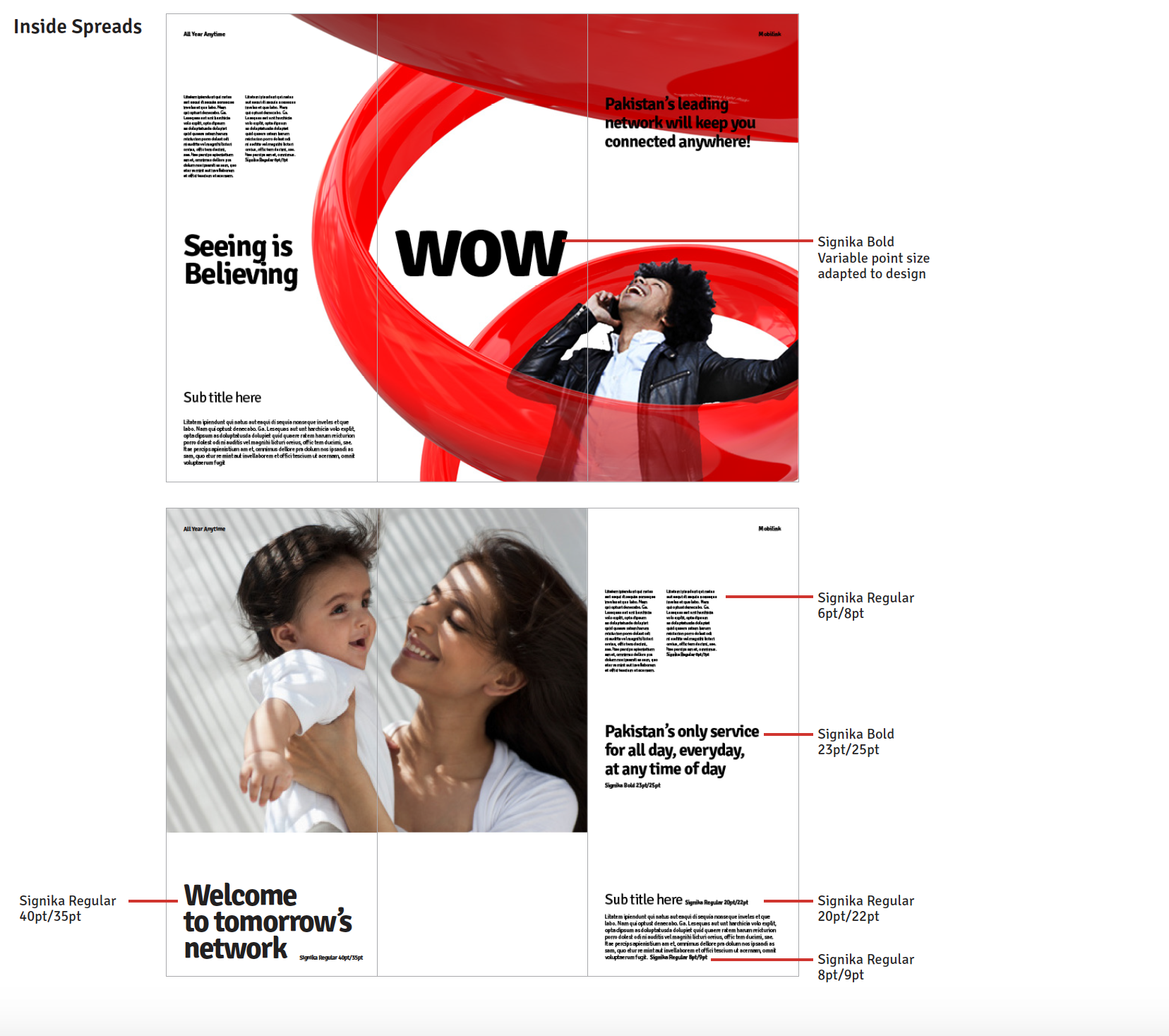
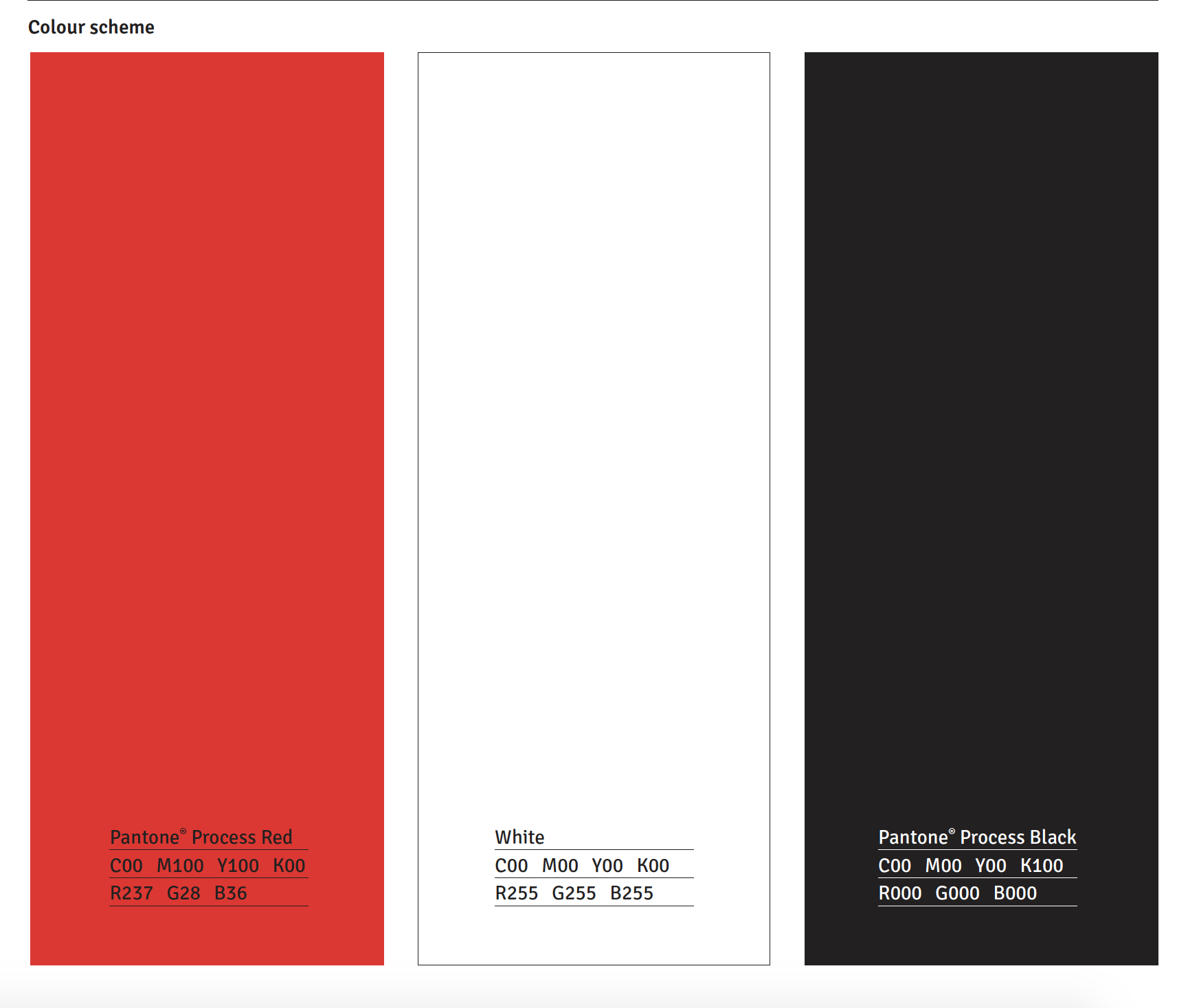
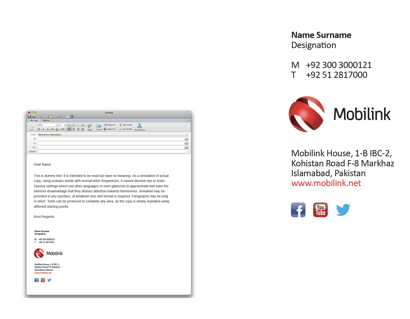
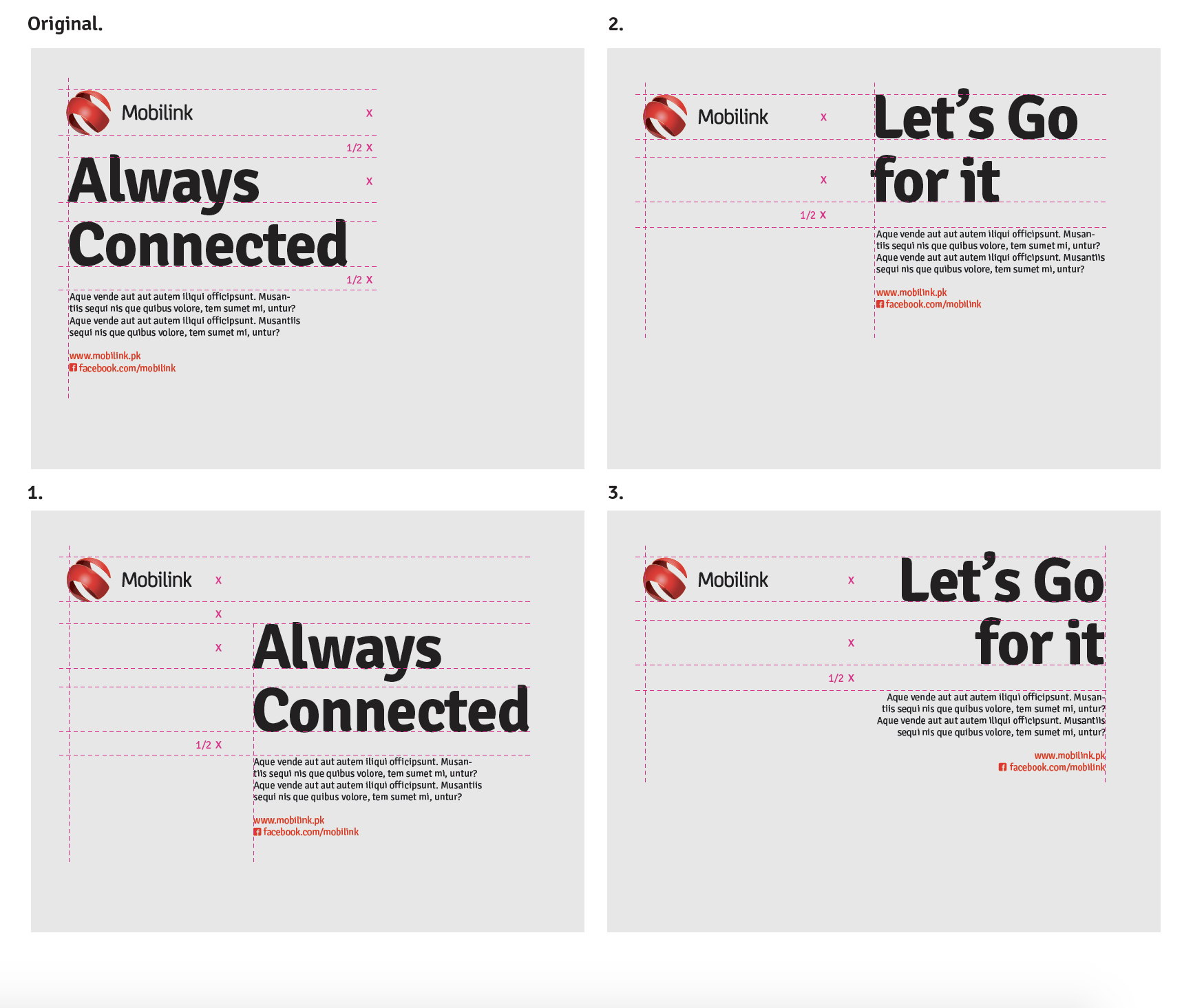
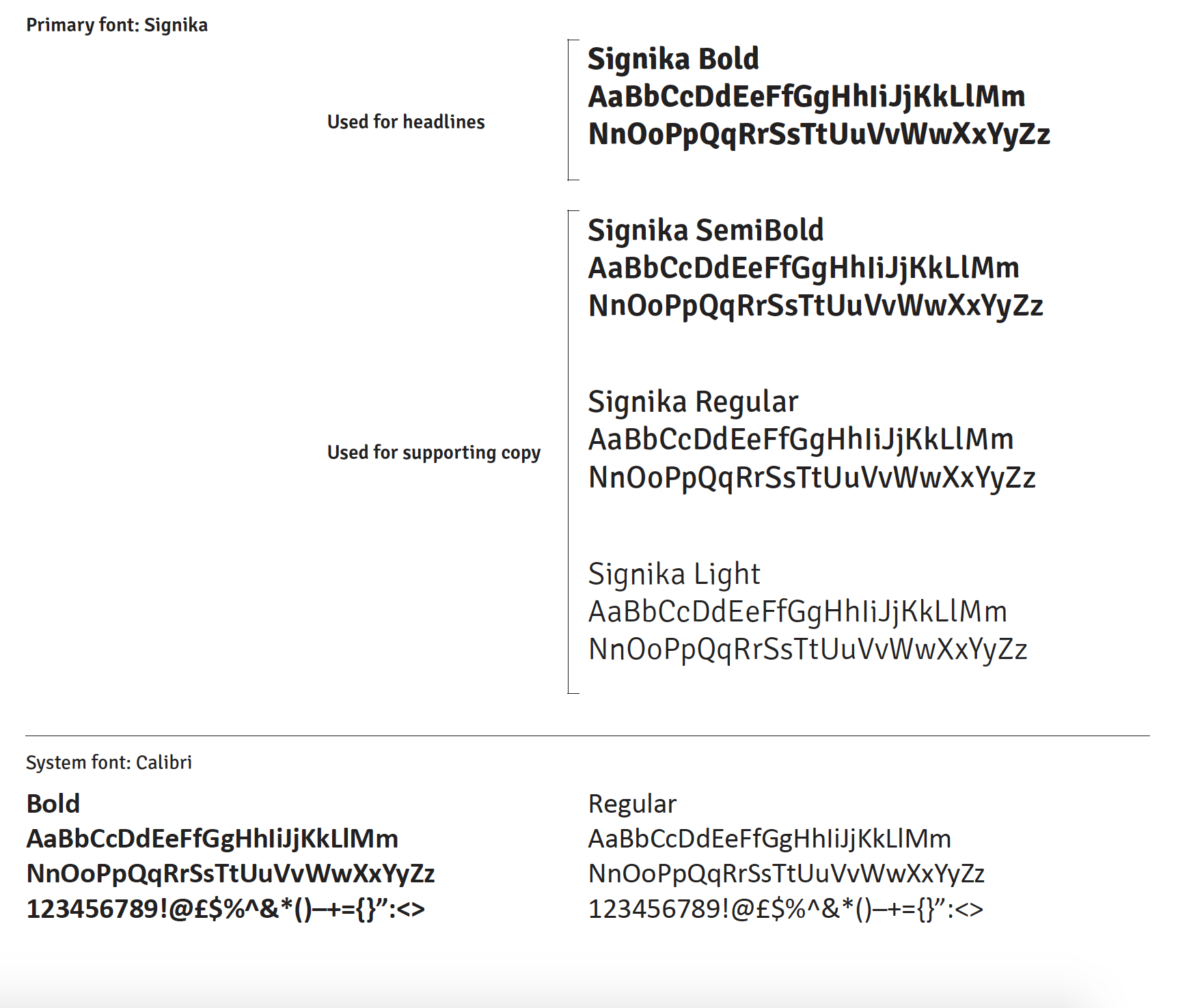
The Primary & secondary color Palette declaration along with primary Typeface are as follows. The primarily used ad-layout can also be seen with dimensions allocated for different assets. The use of email signatures, basic stationery items and Value ad services logos can be seen below.

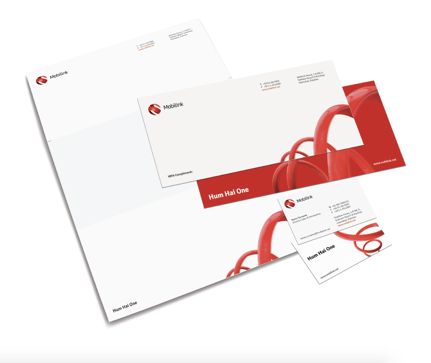
Below you find a few out of numerous usages defined as per guidelines created for
Mobilink new face and identity,
The complete brand-book comprised over 200 pages with major to minor details for each and every
medium and execution.
This is to give an idea only, how detailed I had worked it out. Naturally, corporate style guides and brand-book
have to be detailed for multi-platform executions.
I learnt a lot through this exercise and am happy to work it out while my stay at
Saatchi&Saatchi as Art director and creative head.